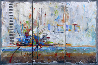
This is my first triptych that I have painted and I really enjoyed working on it. Even though there are three canvases to work on, it all needed to flow together as one piece of art. It is a commission piece that I painted for a client who had a couple of guidelines. First, it had to be a horizontal piece, only 24 inches high. Could be any length because the designated wall was very large.
Secondly, my color scheme was limited, but not limited. (I guess that I mean I was limited, but still had great colors to work with. Kind of like looking at the glass of water…is it half full or half empty?) My client asked that I use the following colors: Blue, just not purpley blue. Metallic silver, and dash of orange would be fun. No bright blues. No yellow. No sage green. No pink. Taupe, silver, neutrals, black, turquoise, dash of purple, little bit of red, browns, whites, beiges would all be good to use.
So, with those guidelines, I set out to paint this triptych. I used my favorite medium, oil paints. I did experiment with some new oil pastels. You can see the pastels if you look closely because it almost looks like a crayon on top of the paint. I used the palette knife to give the paint texture, along with some wide brush strokes.
Several persons who have viewed this see a battleship in the painting. There is a horizon in the painting, and a battleship if your eye sees the focal point as a battleship. I painted an explosion of color, with lines, and shapes. I certainly don’t want this painting to be dull or boring, but exciting and uplifting. I hope that my client hangs the panels of canvas with space between each canvas---maybe a couple of inches. The overall size would be 24 by 40 if there would be two inches between the canvas panels. So, I think that I accomplished what I wanted to do on this piece, and following the guidelines of size and color. I hope you enjoy viewing my artwork. To view more art:
My Website: www.kwyne.com
Studio Website: www.studioartandsoul.com
Kay’s Blog: http://kaywyne.blogspot.com
Daily Painters of Texas Blog: http://dailypaintersoftexas.blogspot.com
Daily Painters Abstract Blog: http://dailypaintersabstract.blogspot.com
Kay’s Cell: 214-532-0325
Email: kay@kwyne.com

Nothing dully here! An exceptional and exciting work!
ReplyDelete